Friday, October 19, 2012

Lab 3: Neogeography


View From Sequoia National Park to Yosemite National Park in a larger map


Neogeography is said to be user-centric, meaning that it is suppose to be fun and easy for the user to look at and to "use." It is also based on what the map creator's purpose is to convey or to show in their point of view to other viewers. Hence, neogeography acts as a social tool because when creating such a map, the creator starts off by using an existing toolset; then, people plot there locations based on there terms and purposes. Along with these point markers on there map come elements such as videos, URLs, pictures, music, and many other social features. Although making neogeographic maps can be fun and easy to use, they also can include lots of error. Based on location of markers, they are inaccurate and not a very good tool to use for navigation.
For the neogeography lab this week, I created a map that was based on some of my most memorable times I had gone camping and sightseeing, plus, other places I would like to go visit when traveling from the Sequoia National Park to the Yosemite National Park. So the way I started the map was by using Google Maps just as every other neogeographic map starts with an existing map tool. I then placed markers in every location I wanted my viewers to see or travel along. In addition, neogeography includes a social aspect, so I added URLs to markers where people can make reservations to stay at, videos to show the types of activities they can do to other markers, and pictures to other markers to show the great sightseeing the location offers. Now people can see the great aspects of the trail; however, neogeography has errors to it. For example, my map includes traveling, which on the map the markers appear pretty close to one another, but in reality, the distance is far apart. Clearly, neogeographic maps lack the scaling when there is navigating involved. Also, the lines I used to show the path do not illustrate the curvature of roads that show the accurate path on going from one place to the next. Thus, neogeography is a great way to communicate maps in a social aspect, yet lack the map centric qualities to navigate. 

Monday, October 15, 2012


Lab 2: USGS Topographic Maps

1. The name of the quadrangle is Beverly Hills.
2. The names of the adjacent quadrangles are Topanga, Canoga Park, Van Nuys, Burbank, Hollywood, Inglewood, and Venice.
3. The quadrangle was first created in 1966.
4. The datum that was used to create this map is 1927.
5. The scale of the map is 1:24,000.
6. A) 5 centimeters on the map is equivalent to 1200 meters on the ground.
B) 5 inches on the map is equivalent to 1.8 miles on the ground.
C) 1 mile on the ground is equivalent to 2.8 inches on the map
D) 3 kilometers on the ground is equivalent 12.9 cm on the map
7. The contour interval on this map is 20 feet.
8. The approximate geographic coordinates of:
A) Public Affairs:118° 26’ 21” East 34° 4’ 28” North; 
Latitude 34.0742  Longitude 118.4392
B) The tip of the Santa Monica Pier:118° 29’ 51” East 34° 00’ 27” North; 
Latitude 34.0075 Longitude 118.4998
C) The Upper Franklin Canyon Reservoir:118° 24’ 40” East 34° 6’ 43” North; Latitude 34.1163 Longitude 118.4115
9. The approximate elevation of:
A) Greystone Mansion: 560 ft; 170.68 m
B) Woodlawn cemetery : 145 ft; 44.19 m
C) Crestwood Hills Park: 650 ft;198.12 m
10. The UTM zone of the map is zone 11.
11. The UTM Coordinates for the lower left corner of the map are 3763 North 361.7 East.
12. 1000 meters squared are contained in each cell of the UTM gridlines.
13. Northing:3771000
Easting Elevation                                           
362000 530
363000 620
364000 640
365000 550
366000 480
367000 455
368000 405
369000 340
370000 298
371000 250
372000 190
373000 152
14. The magnetic declination of the map is +14°.
15. The water in the intermittent stream between the 405 freeway and Stone Canyon Reservoir flows north to south.
16.


Wednesday, October 3, 2012

Lab 1: SSC, SOD survey & a blog


The website this map of New York City comes from is all about New York and how to get around, almost like a blog. New York City is known for its tall buildings and major traffic, which makes getting around in a car pretty difficult to go sightseeing. So the map is designed for people who like to go biking and sightseeing at the same time. The map pinpoints bike routes that go through the city to see the major landmarks that make New York the city it is today. Also, the checklist and captions on landmarks such as the New York Harbor, Brooklyn Bridge, and Central Park make this a unique tourist map that not only show how to get from one place to another, but involve the person to check off the places they go see as they use the map. What I love about this map has got to be the simplicity and colors because as it is New York appears to be complicated with its tall building; thus, this map makes it easier to get around for new comers from around the world.

Alternative New York Tourist Map.New York 101: The Definitive Guide to N.Y.C. http://www.newyork101.net/new-york-map/


los angeles tourist map
The map comes from a site of mixed maps for tourist that vary from navigation to art.This Los Angeles map appears as a toursist map that includes more of an art map that plays with the space between important landmarks in Los Angeles, and less focus on how to get from one place to another. The map also includes captions on certain landmarks and a fun facts side about the city. The design and colors of the map indicate that it is for tourist  because the bright colors and 'cartoonish' structures draw attention as if though the city is being advertised. I find the map interesting because of the way the map plays with the space; the landmarks are very close together so that the viewer sees all the tourist sites in Los Angeles.

Mapsadmin. Los Angeles Tourist Map. World Travel Maps: All in One Place. August 25,2012.    http://worldtravelmaps.info/los-angeles-map-la-california-usa-travel-where-how-and-when/los-angeles-tourist-map


Miami tourist map   
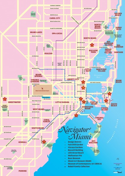
This map of Miami is found on a mapping website that includes many other maps of places around the world. From the first look of this map it is clear that its main purpose is to navigate. Unlike the other two maps which catch attention to the viewer more with its colors and landmark drawings, the map appears more about showing tourist how to get from one destination to another; this can be seen from the mass amount of streets included. The Miami map also includes a key/legend for the different symbols that refer to tourist sites. What I liked about this map was that it included the rail lines that travel throughout the city, which is another way it can be seen as a navigation map.

Miami Tourist Map. Mappery. September 30, 2009. http://mappery.com/Miami-tourist-map