Friday, December 21, 2012

lab 5

When I first started this lab I had a little difficulty trying to pinpoint the two locations, but I soon able to choose the two locations and find the distance. Also, I did not know how to find the ways in changing the projections, but soon I realized that ArcGIS made it easy to change the projections while containing equidistance, equal area and conformal.
EquiDist SinusoidalEquiDist Cylindrical
By looking at these two different projections that have one similar feature, equidistant, we see the differences in viewing maps and the distances between the two cities vary. This goes for all other projections that can vary in equidistant equal area, and conformal. After doing this lab i learned how to select two locations and measure the distance between the two locations.

Overall, the different projections show how one's idea of a map or how they measure locations can vary or change how they imagine an area of specific location based on the projection they are viewing. The six different projections can distort the reality of locations and the features they present. Take these two projections, sinusoidal and cylindrical, which both have equidistant. They both appear different and equidistant is one thing that keeps the lines of at same distance, yet the two projections have other common features such as sinusodial keeps the lines parallel, the equator straight, and  other meridians curved. While cylindrical is a projection of a surface that lies flat or is a flat plane.

Tuesday, November 27, 2012

Lab 8

          In 2009, the Los Angeles County faced a huge fight with the Station fire in August and September. The fire had caused lots of damage and was uncontrollable. It had destroyed 209 structures and threatend 12,000 structures, including Mount Wilson which hold communication towers. (Crouch) In order for the county to control the fire and see what later causes can come from the fire, we look at some maps  that show the movement of the fire across the grassland parks, the elevation of the mountain the fire was on, and the river flow into communities.
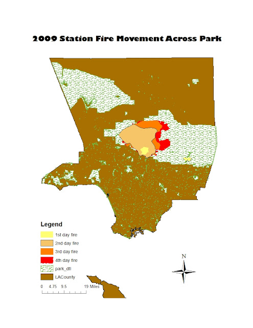
            Hence, after viewing this first map we can see the way the fire is moving day after day across this large land of grass on the park. The fire also gets bigger causing more damage. There are 150 basins in th LA county and 29 are in this burn area, plus there are a combined 1,206,900 cubic yard of material burning here. (Holmes) So by looking at this map we can see that in order to protect these basins we have to see how the fire is moving. Our observation of the map also tells us that there is a lot of land burning and this is causing a huge amount of debris to form.

 
         Now to get further insight on the future events of this fire we take a look at how the debris is falling across the land in order to see if this can cause any damages. Furthermore, we look at the map on the 3D elevation of the burning hill to see how debris falling is going to effect the steep mountains. It is said that Dunsmore Canyon is one of the steep hills affected by the debris and when rainfall comes in on the steep basins there are going to be dangerous flash floods. (Kean, Stanley) Therefore, it is important to observe the 3D elevation because we can stop the future damage of floods and mudslides.
 
 
We can also compare these previous maps with this following map to see the multiple effects of the fire. By looking at all maps, we can see how the fire causes debris and how that debris falls on the land and into the rivers. The debris in this case had fallen into major basins like the ones that flow into the Pacoima Canyon or Big Tujunga Canyon. These were identified as having large volumes of debris flow, greater than 100,000 cubic meters. (Cannon, .etl) This information on the graph is important because it can come in  rushing into communities that can pollute and harm our waters.
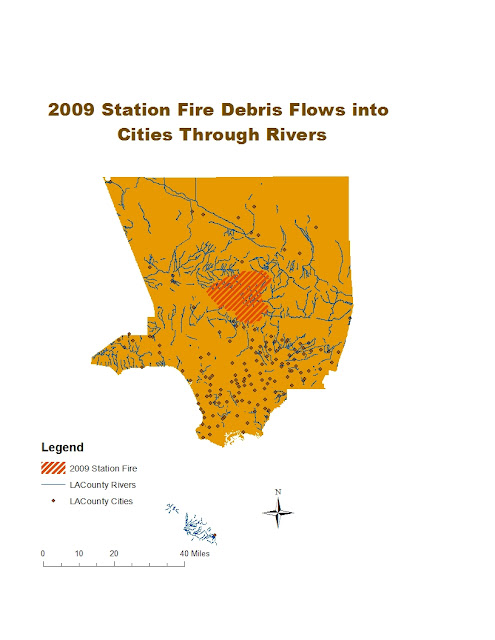
 More than harming our waters, it can destroy our communities because the debris in the rivers and basins get clogged up and the mud and water then come down the mountains and crashing into the communities. Henceforth, on the map we see that the fire is very near a particular set of cities that have rivers flowing through them. There were a total of  43 houses and 25 cars that were damaged, with 12 houses suffering major structural damage. (Petley) Thus, ArcGIS maps come in very good handy because if we put more attention towards these observable pieces of evidence we can prevent future incidents such as those caused by the debris of the 2009 Station Fire.


Works Cited
Cannon, Susan, Joseph Gartner, Michael Rupert, John Michael, Dennis Staley, and Bruce Worstell. "Emergency Assessment of Postfire Debris-Flow Hazards for the 2009 Station Fire, San Gabriel Mountains, Southern California." USGS Science for a Changing World. N.p., 13 2010. Web. 12 Dec 2012. <http://pubs.usgs.gov/of/2009/1227/>.
Crouch, Jake. "State of the Climate Wildfires Annual 2009."National Oceanic and Atmospheric Administration National Climatic Data Center. N.p., 08 2010. Web. 12 Dec 2012. <http://www.ncdc.noaa.gov/sotc/fire/2009/13>.
Holmes, Baxter. "Storm to Test Southern California Debris Basin." Los Angeles Times. N.p., 04 2009. Web. 12 Dec 2012.
Kean, Jason, and Dennis Staley . "2009 Station Fire, Dunsmore Canyon, Glendal California." USGS Science for a Changing World. N.p., 27 2010. Web. 12 Dec 2012. <http://landslides.usgs.gov/monitoring/dunsmore/>.
Petley , Dave. "Mudslides Occur in the Areas Affected by the 2009 Station Fire in Los Angeles." The LandSlide Blog. American Geophysical Union, 01 2010. Web. Web. 12 Dec. 2012. <http://blogs.agu.org/landslideblog/>.


Wednesday, November 21, 2012

Lab 7


For the first map on Number of People in 2000, the map shows that there is large amount of people near the coastal lines than in the center of the United States. Also in Alaska, the number of people is not very large. However, the most amount of people in Alaska can be found in counties near the U.S. than the top part of the State. Overall,, the most amount of people can be found in major counties such as the Los Angeles County or those in New York.
The second map on the difference of number of people from 1990 to 2000 shows relations to those of the first map. For example, major counties still continue to have the largest populations. The changes indicate that overtime counties on the east and west coast continue to grow whereas those in the center states become lower and lower.
On "Percent Change, 1990 to 2000 Total Population," the map show the greatest amount of change in population in counties. It shows that southern mid-west states have the biggest change in population and once again the center U.S. have the lowest change. On the lower east side there also seems to be a larger change in population than those in the upper east side. Thus, the percent change illustrates some different results than those in the previous two maps.
Lastly, the map on population density in 2000, depicts that the greatest amount is on the east side states, and the lowest amount is in the counties that are located in states more in the western side. Particularly on the east side, counties located in the east side show the greatest amount in states such as New York. And on the west side Alaska counties show nearly no population density.
Overall, using ArcGIS for this lab really helped show changes in numbers. Being able to use different colors and ramping colors made it visually easier to see how data is portrayed and what the data is saying. Also going through the tutorial was not difficult, yet it mainly reminded me what to do. In conclusion ArcGIS is a great program that makes seeing data easy to see and comprehend through its division of polygon areas and color schemes it offers.

Thursday, November 15, 2012

Lab 6

After completing all my maps of hillshade, slope, aspect, and the 3D view of the selected area I was able to find out what the selected area was through the extent coordinates in decimal degrees: top 39.8291666661, left -105.788888889, right -104.969444445, and bottom 39.3838888883. The coordinates gave the selected location as Denver, Colorado. Other information about the coordinate system is the spatial reference is GCS_North_American_1983 and the datum is D_North_American_1983. Overall, this lab was a good way of seeing the different layer of data of a location in ArcMap and ArcScene.


Monday, November 5, 2012

Lab Week 4-5


After going through the ArcGIS Map tutorial I came across benefits and pitfalls to the software program. The program has some beneficial aspects that make great maps such as how detailed the user can make a map. For example, when I was using the program, I was able to zoom in and out and adjust the scaling to make the text, markers, and other things clearer when I was trying to fix them.

Another benefit of the software was the link between map and data that I had to add with the noise contour charts. This was a great way to show the data that I was portrayed to the map and the area on the map. It showed the different level in the areas of the map. ArcGIS overall is a great program for detailed maps that involve different data

However, ArcGIS also has pitfalls such as it is very complicated to use and must be completed by following instructions. If it were not for the tutorial I would not know how to use the program, so it is clear that the program is not user friendly unlike the neogeography maps that we completed in last week’s lab. For example, opening the map was complicated and having to export and unzip files was complicated.

To continue, the program was so difficult that even using the tutorial as a guide was sometimes not useful. Such as when putting in the different layers of green on the map to show the different levels did not appear on my map and I could not find a way to bring up the illustration. There were also other common illustrative problems I encountered and is clear that ArcGIS is a useful tool for maps, yet lacks the simplicity for people to use.

Friday, October 19, 2012

Lab 3: Neogeography


View From Sequoia National Park to Yosemite National Park in a larger map


Neogeography is said to be user-centric, meaning that it is suppose to be fun and easy for the user to look at and to "use." It is also based on what the map creator's purpose is to convey or to show in their point of view to other viewers. Hence, neogeography acts as a social tool because when creating such a map, the creator starts off by using an existing toolset; then, people plot there locations based on there terms and purposes. Along with these point markers on there map come elements such as videos, URLs, pictures, music, and many other social features. Although making neogeographic maps can be fun and easy to use, they also can include lots of error. Based on location of markers, they are inaccurate and not a very good tool to use for navigation.
For the neogeography lab this week, I created a map that was based on some of my most memorable times I had gone camping and sightseeing, plus, other places I would like to go visit when traveling from the Sequoia National Park to the Yosemite National Park. So the way I started the map was by using Google Maps just as every other neogeographic map starts with an existing map tool. I then placed markers in every location I wanted my viewers to see or travel along. In addition, neogeography includes a social aspect, so I added URLs to markers where people can make reservations to stay at, videos to show the types of activities they can do to other markers, and pictures to other markers to show the great sightseeing the location offers. Now people can see the great aspects of the trail; however, neogeography has errors to it. For example, my map includes traveling, which on the map the markers appear pretty close to one another, but in reality, the distance is far apart. Clearly, neogeographic maps lack the scaling when there is navigating involved. Also, the lines I used to show the path do not illustrate the curvature of roads that show the accurate path on going from one place to the next. Thus, neogeography is a great way to communicate maps in a social aspect, yet lack the map centric qualities to navigate.